Game of Thrones Design Challenge
For the past two or three months, I have been intermittently working on a design challenge created by a YouTube channel called, the Futur. The challenge was about Game of Thrones and it was a way to celebrate the last season that ended a few weeks ago. By the way, I will not be discussing any about any disappointments I may have had about this last season. XD This entry is just a description about my design process for all three parts of the challenge.
The challenge consisted of picking a house from the GoT TV show and creating a sigil, a wordmark and a poster. All three projects were split into three different parts, but the poster would be combined with all previous works. The main instructions from the Futur was to make the designs legible, unique, bold and appropriate to the show.
Part 1: The Sigil_
The house_
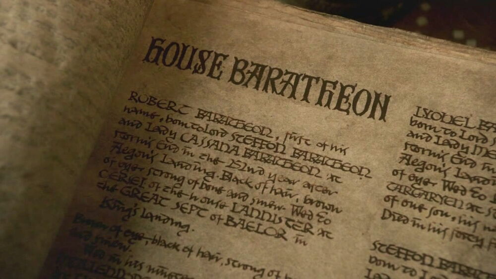
I went for the almost extinct house that had probably no fans left, but I’m a walking contradiction. Instead of making it simple for myself and picking a popular house, I picked House Baratheon. I have the tendency to corner myself when making choices.
The research_
I would recommend anyone not to skip this part of the process despite working from a brief given by an art director. Usually briefs are very concise and can help you get started with the right look for the design you are working on. However, if you are not familiar with what you are being asked to create, then this part of the design process is essential. Don’t jump into sketching anything right away or at least don’t get too attached to whatever you create at the beginning.
I always spend more time doing research than designing itself. I also altered my sources. I know the books had more meaty content to pick from, so I decided to use the Song of Ice and Fire wiki website for more information about the House of Baratheon. With any good Fantasy story like GoT, the lore always comes with an expanded universe, characters and stories. I did this and I also did a mind mapping exercise. There is also another thing that I had to take into consideration, which is that the show and the books are a more gritty and realistic version of fantasy. This also comes in handy to make the design pieces more appropriate.
Aside from googling things related to the show itself, I also decided to do some reading about stags and learn more about the animal characteristics. This is very important when you create abstractions or drawings of animals, people and even things or locations. Determining key characteristics of what you are set to draw or design will help you make creative choices along the way. It will also help you with abstraction.
The third aspect in my research was about digging the realistic aspects of the show and the books. I already knew this from reading parts of the books a few years ago, but I went in and did some further reading and YouTube bingeing about the War of Roses since George R. R. Martin used this real life conflict as inspiration for The Song of Ice and Fire series. This Civil War happened towards the end of the 15th Century in England and similar to Game of Thrones, it was the fight of two Houses for the Throne of England. The conflict ended in the birth of one of the most important dynasties in English History, The Tudors. This helped establish the right century to base my style for the pieces.

Developing the concept_
Now that I sort of had some idea, I decided to do some mind mapping exercises. This is important because it helps you filter out excess information and also helps you determine what is going to be the key words to help you find the right images for references. I personally do this while I’m doing the research back to back in order to polish my research.
After picking up the keywords from the research and the mind mapping session, I went online and picked some visual references for three key elements: Game of Thrones Baratheon visuals, images of Stags, and images of printed books and engraved illustrations from the 15th century.

The sigil design_
I did some quick sketches on paper, decided to showcase two key words: fury and royalty. A rampant position would have been a bit more dynamic but it’s hard to showcase fury in that position. Those animals usually display more agile characteristics, but using the eyes and the antlers to showcase the imposing nature of an adult stag felt like the right decision.
I drew the whole concept in Procreate and then created the final version in Affinity Designer on my iPad since it was very convenient, and I wanted to learn the application. The process was quick and pretty smooth. I had some difficulties with Affinity but it was mostly because I’m not used to working with the application. I ended up loving it.

Part 2: The Wordmark_
The script_
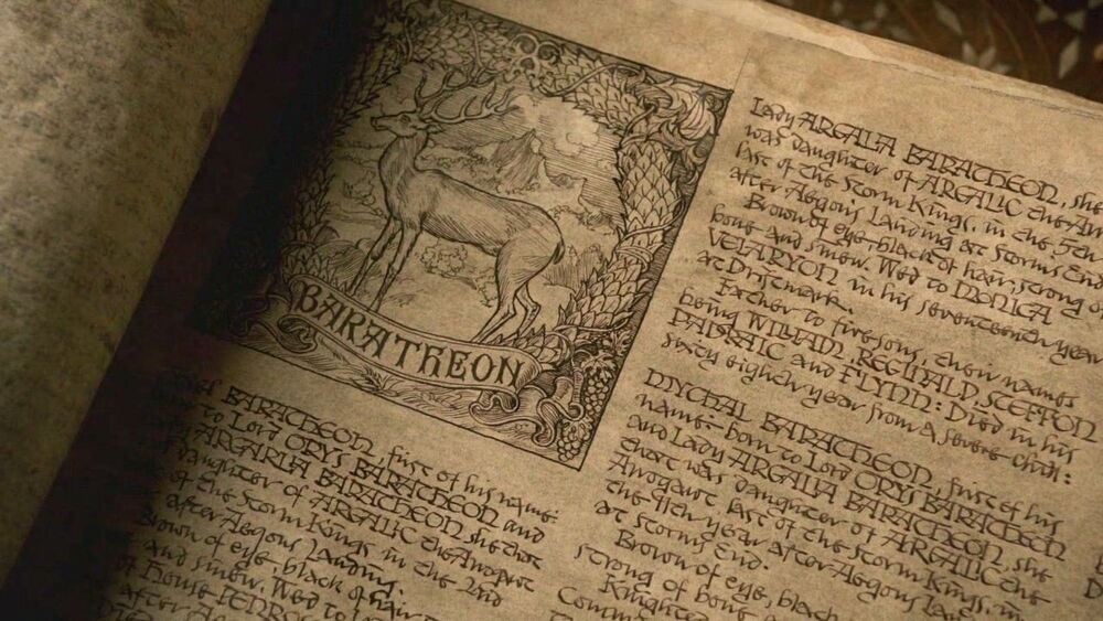
During my research and mind mapping session I encountered the usage of Uncial and Gaelic scripts all throughout the ASoIaF fan wiki and in some of the TV Shows props. These types of scripts were also common with illustrated manuscripts and printed books back in the 15th century and prior. I did not want to make the wordmark too complicated, and I wanted it to fit with the sigil. Therefore I decided to look for an uncial font that matched the shape of the antlers.
Modifying the font _
I found a font I liked and did the lettering based on that. I altered the letters and applied some kerning. Then, as a way to show continuity with the show I applied the bars used in the GoT. I checked the meaning, and apparently throughout different seasons, the amount of bars varied so I just kept it at three to reference the three brothers. As a side note, I think I spent more time adjusting the kerning of the Wordmark, and I was still tweaking it right before I submitted. I am still not 100% happy with the results.


Part 3: The Poster_
Change of style and references_
Working on the poster ended up being the simplest part of the challenge. I was not sure I could really get it done, because I’ve been super busy with finishing Oak & Iron’s game components. I was also finishing some personal projects, but when the third part of the challenge was announced, the Futur flipped the script a bit with their brief. They said they wanted something minimal and similar in style to what Olly Moss does with his movie posters. In a way, that saved me a lot of time.
Examples of Olly Moss’ work


Since I didn’t have much free time, I asked some of my friends who are GoT fans what I could look into about the house of Baratheon and one of them mentioned Robert’s hammer. His description definitely sparked my attention. I looked into the Song of Ice and Fire wiki for more details and I was fascinated by the Robert’s Rebellion storyline since it triggered all the events in the books and the show, specifically the Battle of The Trident. The way it was described and depicted by the books was very epic. This battle resulted in the Rebellion and that sort of lead Robert to become king. Since it was such an important moment for the House of Baratheon I went ahead and decided to use it as an important theme in my poster. I also did some extra research on Olly Moss and checked what kind of style I could go for. I liked his double exposure inspired scene posters.
The first thing I did was to draw a rough composition in Procreate of how I wanted the poster to look like. One thing I wanted to make sure with this poster was to establish some continuity from the sigil and the wordmark so I made sure to draw the stag’s antlers similar to the one from the sigil. The other thing I had to do was to make enhance the double exposure effect with the clever use of negative space. I manipulated the drawing of the stag so the eyes would be the moon and the mountain on the left would be the inside of the ear of the antler. Then I used Photoshop to add effects and color correct it.

Bonus Poster_

References_
https://en.wikipedia.org/wiki/Attitude_(heraldry)
You must be logged in to post a comment.